Infrastructure projects stretch across years, sometimes decades. They carry dense engineering detail and demand clear communication between technical teams, stakeholders, and public audiences. Meanwhile, construction firms keep stacking digital tools — the average business now runs more than six technologies, a 20% jump from last year — because advanced models make design and delivery easier to manage.
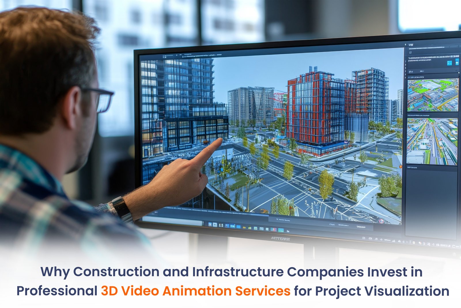
3D visualization rides that same wave. It turns heavy technical models into something people can actually see and understand. When miscommunication can stall timelines and inflate costs, that clarity matters. Dynamic visual models let stakeholders grasp the project before ground breaks, tightening alignment and building confidence early in the lifecycle.
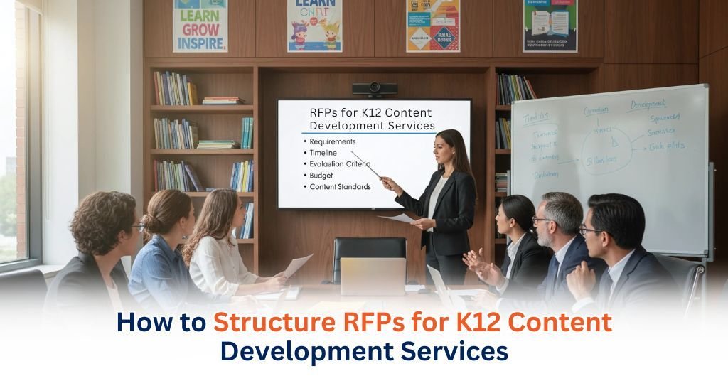
Why Infrastructure Projects Are Hard to Communicate with Traditional Plans
Traditional infrastructure documentation leans heavily on 2D technical drawings. Plans, sections, and elevations are supposed to represent something that exists in full three dimensions. On paper, it looks orderly. In practice, the reader has to rebuild that depth in their head. Engineers are trained for this, but interpretation still rides on spatial reasoning, and that skill is not identical across people.
So even when everyone is looking at the same sheet, they are not always seeing the same structure. The drawing stays fixed. The mental reconstruction does not. That gap is small on simple work and grows fast as complexity rises.
On complex projects — phased construction, utility routing, site logistics — those flat views start to feel stretched thin. Engineering graphics research already points out what happens next: readers have to mentally rebuild depth, sequence, and interaction in their heads. That extra reconstruction creates room for mismatch.
When teams picture the same drawing differently, coordination gaps show up between planners, engineers, contractors, and reviewers. The drawings are not wrong. The limitation sits in the medium itself. Static sheets struggle to carry dynamic spatial intent. As infrastructure projects grow in scale and moving parts, translating that intent through flat documentation alone becomes harder, slower, and more fragile.
Turning Engineering Data into Visual Project Narratives
Engineering data does not become a visual story by magic. It starts inside structured digital models. CAD and BIM already hold the geometry, spatial layout, and system relationships that explain how infrastructure actually fits together. When that data moves into animation, the project stops feeling like scattered drawings. You begin to see construction as an ordered workflow — what goes in first, what depends on what, and how systems stack in real space.
That motion exposes logic you would otherwise have to imagine. Installation order, system interaction, and site progression play out in sequence. Structural, mechanical, and utility elements stop fighting for clarity because timing reveals how they coexist.
Even site staging becomes visible as the environment evolves. Nothing gets reinterpreted. The visualization pulls straight from engineering data, so the technical intent stays intact while the project suddenly reads like a process you can follow.
Supporting Stakeholder Alignment and Decision-Making
Infrastructure decisions force people with completely different technical comfort levels to judge the same project scope, sequencing, and impact. That mismatch creates pressure right at the planning table. Project management literature keeps warning that when communication leaves gaps, interpretation starts drifting, and small misunderstandings snowball into scheduling or budgeting trouble.
Visual briefings act like a shared anchor. Those visuals take raw engineering intent and make it readable for people who don’t live inside technical drawings — investors, planners, approving authorities. Instead of guessing what a sheet means, everyone sees the same story. When early conversations lean on that shared visual reference, hidden assumptions come out immediately, before they lock themselves into real decisions.
Once architecture, engineering, construction, and oversight teams start pointing to the same representation, coordination stops feeling scattered. Ambiguity loses its grip because everyone is anchored to one frame of intent. Real stakeholder alignment isn’t just about being technically correct. It’s about presenting information in a way that leads diverse decision-makers to the same conclusion, not parallel interpretations.
Construction Sequencing and Risk Visualization
Construction sequencing is where a build either makes sense or starts fighting itself. Every stage affects structure, logistics, and safety, so teams have to see how actions ripple forward before anyone steps on site. Digital planning tools let them simulate those stages in advance. They can test order, access, and coordination instead of guessing under pressure.
Building information modeling describes clash detection as a way to catch spatial conflicts before they show up in the field. That early visibility cuts interference that would otherwise stall work. Visual sequencing also lays out equipment paths, staging zones, and safety buffers — all critical in construction management.
When teams walk through a simulated progression, they pressure-test feasibility and adjust plans before committing resources. Visualization becomes an analytical tool tied to engineering data. It sharpens risk awareness and decision-making without replacing formal construction documentation.
Regulatory, Public, and Community Communication
Infrastructure projects don’t just move forward on drawings and specs. They pass through formal reviews where scope, impact, and design intent have to make sense to people outside the engineering bubble. Regulatory practice pushes for transparent communication because authorities and communities need to judge how a project touches land use, safety, and the built environment. When that explanation gets muddy, trust starts slipping.
Visual materials steady the conversation. They show proposed changes in a way that reduces pure reliance on technical interpretation. Once stakeholders can actually see how infrastructure fits into existing conditions, the discussion shifts from abstract language to a shared reference point.
That clarity helps agencies run structured reviews and gives communities a fair read of the outcome. Visual communication doesn’t replace formal documentation. It sits beside it, improving access and understanding. Strong presentation builds trust, invites informed feedback, and keeps public interpretation aligned with the documented intent.
Training and Operational Preparedness
Infrastructure delivery only works when teams understand procedures, sequencing, and safety expectations before anyone steps onto the site. That foundation is not optional. Construction management practice treats training as a structured system designed to make task execution repeatable and safe. When that structure is weak, confusion shows up in the field.
Visual onboarding closes that gap. It connects written procedures to workflows teams can actually see, so operational steps stop feeling abstract. Sequenced visuals make coordination rules obvious and show where timing and interaction matter. Safety preparation also lands harder when crews review scenarios that mirror field conditions instead of decoding dense manuals alone.
For complex builds, this visual layer reduces mental overload. Teams don’t fight the documentation — they recognize it in action. That link between operational knowledge and shared visual reference supports consistent execution grounded in established construction practice.
Scalability Across the Project Lifecycle
Infrastructure projects don’t sit still. They move from planning to execution to reporting, but the core project story has to stay intact the whole time. Project lifecycle management keeps stressing the same idea: structured knowledge assets prevent teams from redefining intent every time a phase changes. Without that anchor, information starts drifting.
Visualization materials built during planning carry that anchor forward. They pull directly from project data, so teams reuse the same visuals, keeping stakeholders aligned and preventing interpretation drift as responsibilities shift across phases.
Consistent visual references act like a stabilizer across communication channels. They limit interpretation drift and protect continuity during delivery. Over time, this lifecycle reuse turns visualization into working infrastructure — not just an approval tool, but a living reference that supports coordination, reporting, and shared understanding from start to finish.
Production Considerations Unique to Infrastructure Visualization
Production planning for infrastructure visualization lives in a tight space: you have to preserve engineering intent while turning dense models into something people can actually view.
Engineering documentation standards push accuracy and traceability hard, so every visual has to stay locked to the source design data. The amount of environmental and structural detail shifts depending on whether the model supports review, training, or communication, which means teams adjust representation without touching the core specifications.
That only works when engineers and visualization specialists stay in constant sync, checking geometry, sequencing, and terminology before anything leaves the pipeline. As designs evolve, version control becomes the guardrail. It tracks revisions and keeps outdated visuals from floating around. This discipline keeps visualization honest, current, and reliable for everyone reading the project.
Conclusion
Infrastructure visualization changes how teams actually think through a build. When project data shows up as structured visuals, scope, sequencing, and risk stop feeling abstract. People see what they’re deciding on. Conversations sharpen because everyone is reacting to the same representation instead of interpreting dense documents in isolation.
When companies evaluate 3D video animation services, they should look for partners who protect engineering accuracy, respect workflow discipline, and plan for lifecycle reuse.
QA Solvers builds around that expectation. Their professional 3D animation, technical visualization, and content development services translate validated project data into visuals teams can rely on.
That shift turns visualization into a working tool, not decoration. Coordination tightens. Decisions carry more confidence. Communication stays steady from planning through execution because every stakeholder reads from the same visual source