


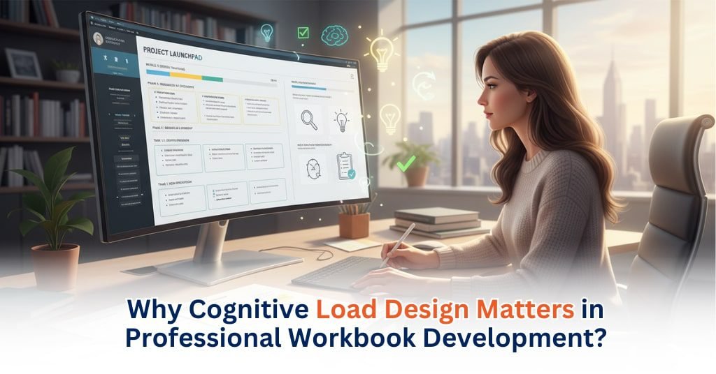
Effective workbook design plays a crucial role in student success and workforce training in the U.S., especially as institutions increasingly rely on professional workbook development services to produce clear, consistent learning materials.
Research shows that human working memory has limited capacity when processing new information, and instructional systems that overload it hamper learning.
By applying cognitive load design principles—such as clear layout, chunking, and aligned visuals—developers can reduce unnecessary mental strain and help learners focus on problem-solving.
Workbooks that respect cognitive load result in better comprehension, faster skill acquisition, and more reliable retention. Such design isn’t optional—it’s foundational for learning materials with real impact.
Understanding Cognitive Load Theory
Cognitive Load Theory explains how the brain processes new information, and it shapes how effective workbooks are in U.S. classrooms and training programs. Intrinsic load reflects the natural complexity of a topic, such as multi-step algebra or scientific processes. Extraneous load comes from poor design—cluttered pages, unclear visuals, or inconsistent layouts that drain mental energy. Germane load is the productive effort that helps learners build skills and form long-term understanding. Research shows that high extraneous load lowers comprehension and slows performance, making learning less efficient. Effective workbook design reduces that unnecessary strain and supports germane processing, helping learners stay focused on what matters.
How Poor Workbook Design Overloads Learners
Poorly designed workbooks hit you in a way that instantly sets off that tight, crawling feeling under your skin. You open a page, and it’s just dense text, unclear instructions, and messy formatting—so much noise that you can almost feel your brain pull back.
In U.S. classrooms, students push through math pages where the real steps get buried, science diagrams that look like someone dumped every label they could find, and reading passages squeezed so tight they feel hostile.
Corporate learners face the same thing in compliance modules with mixed fonts, scattered icons, and task flows that make you second-guess every move.
When a page looks like that, the learner stops learning and starts surviving. They guess steps. Their working memory gets stretched thin. Real understanding slips, and you can see disengagement settle in. Errors creep in. Retention drops. A clear, structured workbook doesn’t trigger that whole internal storm. It calms the page and lets the learner stay with the task instead of fighting the layout. That’s the shift that actually supports outcomes.
Why Cognitive Load Design Matters in K–12 and Higher-Ed Workbooks
Cognitive load design hits fast and hits deep because it shifts how students learn in K–12 and higher education across the U.S. When we cut out the extra barriers for multilingual learners, struggling readers, and students with processing difficulties, something changes—you can feel the tension drop.
Clear pages stop pulling their attention in ten directions. They stop fighting the layout and finally focus on the real ideas.
And once the structure gets clean—straight instructions, steady formatting, no chaos—engagement rises on its own. Fewer mistakes. Fewer mix-ups.
Cognitive load research keeps saying the same thing: when you remove the noise, students hold on to information longer and take on tasks with more confidence. Logical sequencing, purposeful examples, and space to think give their minds room to build strong schema and push deeper into reasoning.
In a well-designed workbook, students use their energy to learn, not to decode what the page is even trying to say.
Cognitive Load Design Principles That Strengthen Workbook Development
Strong workbook design hits you the same way a sudden, sharp moment of clarity does. You look at the page, and you don’t feel that rush of mental chaos piling up in your head. Cognitive load principles do that—they pull the pressure off so learners don’t feel their minds tightening under too much information at once.
A clear visual hierarchy pulls your eyes exactly where they need to go. Headings, spacing, steady formatting—nothing fights you. Chunking and sequencing break big ideas into steps that don’t make your brain feel like it’s sprinting with no warning.
Working examples feel like someone finally saying, “Here, watch this first,” before throwing you into a task—something that matters a lot in math, science, and technical subjects where one wrong turn can send you spiraling.
Reduced split-attention keeps text right next to the diagrams or charts it belongs with, so you’re not stuck flicking your focus back and forth, feeling that slow build of frustration. Minimalism stays purposeful. No noise. No clutter. Nothing that makes you feel the urge to pull away from the page.
And when navigation stays consistent—same place for instructions, same place for labels—it takes away that sudden jolt of disorientation that breaks your flow.
These principles shape print and digital workbooks so learners can move through them without that heavy, dragging confusion. They keep learning steadily across K–12, higher education, and professional training.
Applying Cognitive Load Design in Digital Workbooks
Digital workbooks—whether interactive PDFs, LMS modules, or mobile-first layouts—hit learners with a different kind of mental load. The moment the screen feels cramped or confusing, the brain checks out. So spacing needs to breathe, buttons must sit where you expect them, color contrast has to stay readable, and navigation should feel almost obvious.
Drag-and-drops, simulations, and branching tasks can pull learners in fast, but if the interface feels chaotic, the load spikes. In U.S. classrooms or through professional workbook development services in UK, cognitive load design keeps these features steady instead of overwhelming.
Standards like WCAG, ADA, and Section 508 step in like a final safety net. They strip away barriers that trip learners with visual, auditory, or processing needs. And when all of this comes together, digital workbooks stop feeling heavy. They move smoother and cleaner, almost like the content is clearing a path for every learner the moment they open it.
How Cognitive Load Design Improves Learning Outcomes
Cognitive load design hits fast because it changes how learners take in information in U.S. classrooms and corporate training.
When layouts are clear and tasks stay structured, learners stop tripping over the page and start getting the work done with fewer errors. The brain finally focuses on the real concept instead of fighting through clutter.
Teachers and trainers feel the shift too—they stop repeating instructions and move toward deeper thinking. And in corporate spaces where accuracy drives compliance, safety, and technical work, lower strain keeps people from making mistakes that echo through performance.
This is why professional workbook development services matter—they steady the learning experience, cut frustration, and help learners move with more confidence.
Conclusion
Cognitive load design hits fast because it turns workbooks from confusing pages into tools that actually guide learners. When the structure is clean and the flow makes sense, learners stop fighting the layout and start moving through tasks with real focus.
QA Solvers leans into this with its professional workbook development services in the USA—tight sequencing, strong accessibility, and careful editorial checks.
Once these principles lock in, workbooks feel lighter to use, easier to navigate, and far more supportive in classrooms, training spaces, and digital setups.